©
Date
Jul 2025
Client
AusBiotech / Wattle St.
Industry
Medical and Biotech
Timeline
6 Months


The Opportunity
The goal is to establish a modern, consistent, and scalable visual hierarchy for the master brand and align event and sector-based identities within AusBiotech.
Wattle St Medical Marketing engaged Nick to support the audit and redevelopment of the AusBiotech brand. An issue faced by many industry and non-profit organisations is that, over time, branded materials can lose structure and consistency. It is essential to maintain a unified voice across all member-focused marketing efforts. Additionally, competition from other industry-based organisations has expanded their market share. AusBiotech needed to strengthen its presence and deliver greater value to its members. This project aimed to clarify AusBiotech’s core strengths and focus areas.
The Opportunity
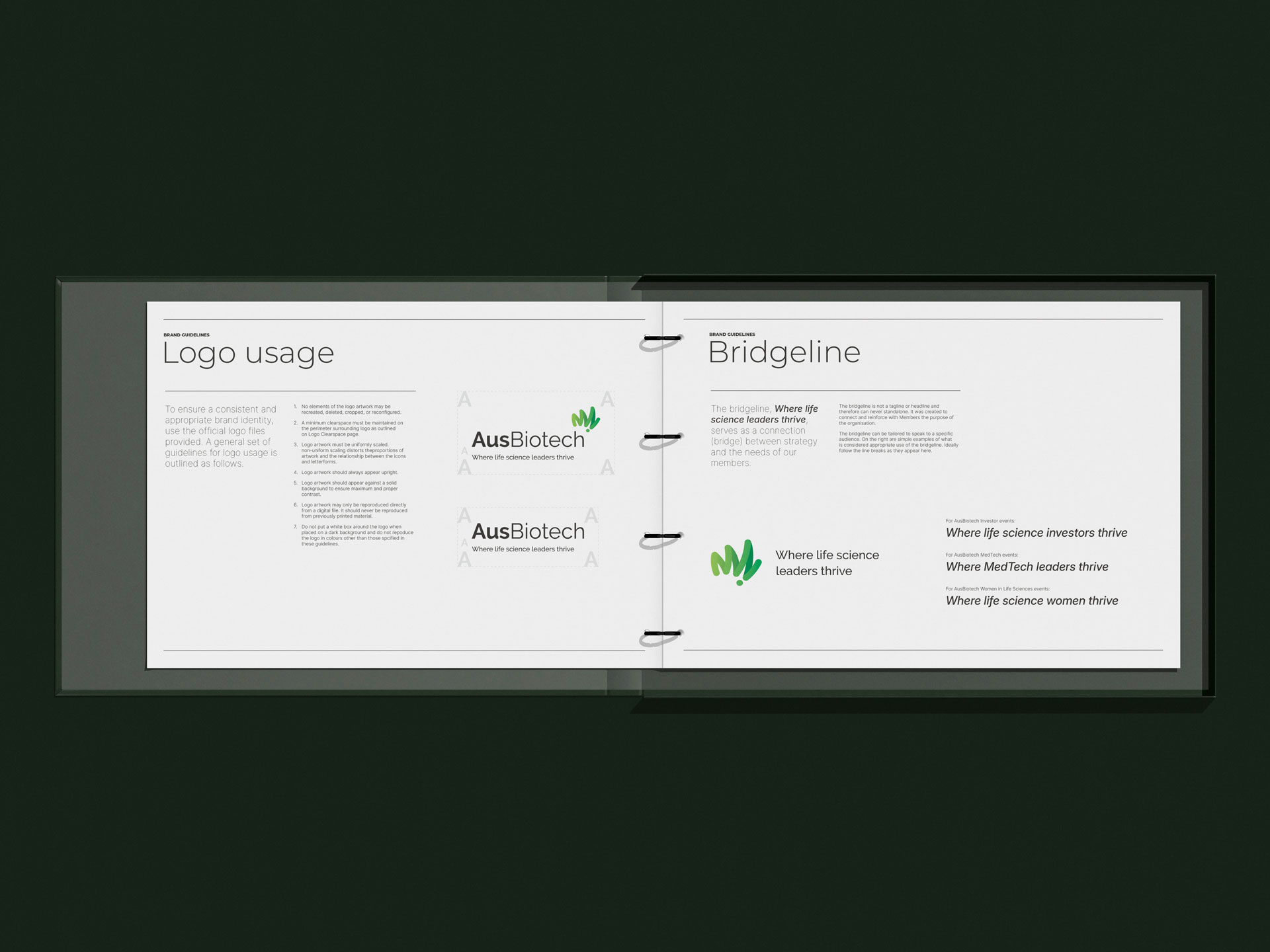
Artikel worked with Wattle St. to develop a visual identity that builds on the sector’s existing brand recognition and trust. Nick refined the visual identity to ensure consistency and flexibility, aligning with the master brand, supporting sub-sector brands, and delivering event-based content.
Artikel proposed a modern take on the existing brand mark, supported by a refreshed colour palette and a clean typographic hierarchy. A striking and flexible visual identity system that reflects AusBiotech’s organisational structure, industry expertise, and values. Clear and purposeful visual language that communicates Ausbiotech’s mission. A scalable, modular visual architecture that supports future marketing initiatives and product launches.

Conclusion
The new brand identity, launched in 2025, and was very successful.
Artikel continues to supports AusBiotech with graphic design for member materials, sector reports, Austrade reports, and exhibit graphics. The updated look has improved member recognition, loyalty, and market consistency.
Latest projects